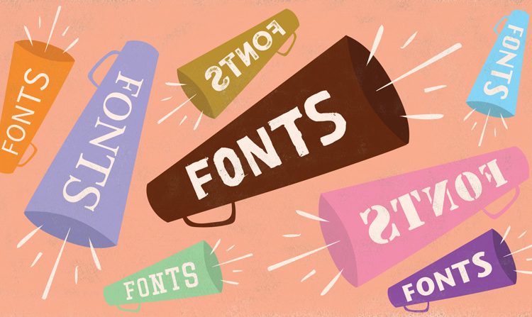
When it comes to communication, written text plays a vital role in conveying information, emotions, and ideas. The fonts we use can significantly impact how others perceive our message. In this article, we’ll delve into the world of text fonts, exploring the importance of choosing the right cute fonts and how it can influence the effectiveness of your written communication.
The Power of Typeface Selection
In our digital age, where text is everywhere, font choice should not be underestimated. Typeface selection goes beyond mere aesthetics; it affects readability, tone, and the impression you leave on your audience.
Serif vs. Sans Serif: The Age-Old Debate
One of the first decisions you’ll face when choosing a font is whether to use a serif or sans-serif typeface. Serif fonts have small decorative flourishes at the ends of the characters, while sans-serif fonts have clean and simple lines. Both have their strengths and can be used effectively depending on your purpose.
The Impact of Font Size and Spacing
Choosing the right font size and spacing is just as crucial as selecting the typeface. Too small, and your text becomes difficult to read; too large, and it may appear unprofessional. Proper spacing between letters and lines enhances readability and comprehension.
Mood and Personality: Font Styles Matter
Different fonts evoke different emotions and convey distinct personalities. For example, a playful script font may be perfect for a children’s book cover. In contrast, a bold and angular font can give a tech company’s logo a sense of strength and innovation. Your font choice should align with the mood and personality of your message.
Branding with Fonts
Businesses often use fonts as part of their branding strategy. Consistency in font usage across marketing materials, websites, and product packaging helps establish brand recognition. Selecting the right font can reinforce your brand’s identity and message.
Custom Fonts: A Unique Touch
Some companies opt for custom-designed fonts to stand out from the crowd. These bespoke typefaces are explicitly created for the brand, adding a unique and distinctive element to their visual identity. Custom fonts can be a significant investment but offer exclusivity and brand recognition.
The Dos and Don’ts of Font Combinations
Mixing fonts can be a powerful tool when used correctly, but it can also lead to chaos if done haphazardly. Combining serif and sans-serif fonts or using different weights and styles of the same typeface can add variety and hierarchy to your design. However, it’s crucial to maintain consistency and ensure that the fonts complement each other.
Conclusion
The choice of text fonts is not a trivial matter. It significantly impacts how your message is perceived, from the formality and readability to the emotions it conveys. Whether you’re designing a website, creating marketing materials, or simply composing a document, take the time to consider your font choices carefully. Remember that fonts are more than just letters on a page; they are crucial to effective communication. So, next time you sit down to type, think about the story your fonts are telling.


